In the first part of this series, we looked at the basics of color — how we see color, and how we can represent it numerically in the various systems that deal with color in a quantitative manner. Now let’s look at what it takes for a display to be color-accurate, and why this can be a particular challenge in mobile devices.
Looking ahead, in the third and final part of the series, we’ll wrap up with some consideration of how the whole video chain contributes to the ability to deliver the right color.
So what do we mean by ‘accurate color’ in these terms, and what does the display have to do — and be — to produce it?
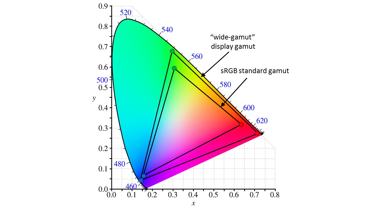
Remember this diagram from the first article? It’s a chart of the color coordinate system we introduced then, technically referred to as the CIE xy chromaticity diagram, or a representation of the Yxy color space.We’re taking a look at just what it takes for a display to be color-accurate, and why this can be a particular challenge in mobile devices. (Remember the “Y” here is luminance, what we usually think of as “brightness,” and in this diagram would be the third dimension — an axis sticking “up out of the screen,” at right angles to the plane of the diagram shown.)
The triangle shown in this diagram is the color gamut that you get from the three primary colors at the corners of the triangle; in other words, the range of colors you can produce through various combinations of these three colors. So what do we mean by “accurate color” in these terms, and what does the display have to do — and be — to produce it?
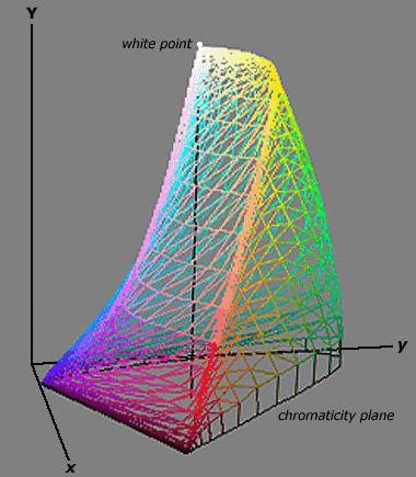
This “space” (the total possible range of all Y, x, and y values) was derived from the curves that describe how the eye sees color in the first place, and so it covers the full range of color and brightness values that the eye can see. The full Yxy space is actually a three-dimensional volume, which turns out to be rather oddly shaped, as shown below.

handprint.com The full three-dimensional Yxy color space
The important thing here, though, is that any color you can see is somewhere within that space.
We don’t often see the full 3D volume used in this sort of discussion, because of the obvious difficulties of accurately showing what’s going on in a 3D space through a 2D medium. So from here on out, I’ll also be using the simpler 2D xy diagram; just keep in mind that we’re actually talking about things that really need three numbers to correctly describe.
Since any particular display only has three primary colors to play with, we’re always going to see display gamuts as triangles within this space as we saw above. No display with any reasonable number of practical primary colors can ever hope to cover all the possible colors the eye can see. Their color gamuts will always be less than the full color space.
This doesn’t necessarily mean the best color possible comes from widest/largest color gamut we can get. Image capture devices (cameras) also have limits of their own, like any other delivery medium such as print or film. So the people who create the various sorts of image content, like movies and photographs, pretty much always work within an established standard color space. The term “color space”refers to both the total range of possible colors, as in the Yxy space we’ve been talking about, as well as the specific regions within that space that these various standards define. The most common standard space currently for digital photography is still the sRGB space, originally defined by HP and Microsoft back in 1996. It also just so happens the standard color space for digital television, a spec commonly known as “Rec. 709,” uses the same primaries as sRGB. The gamut for both of these is shown in the xy diagram above.
Neither standard is what you’d call a “wide gamut” spec, but both are larger than what’s provided by a lot of smartphone and tablet displays, especially LCDs. One of the advantages provided by OLED technology may be a wider color gamut. If you’re dealing with material, whether video or still images, created with the sRGB/Rec. 709 primaries in mind, you ideally want the display to use those same primaries. You clearly don’t want a smaller gamut, since then some colors in the image data simply wouldn’t be possible produced by the display. However, smaller-than-standard gamuts have long been the norm in mobile devices.
Smaller-than-standard gamuts have long been the norm in mobile devices
Using less saturated primaries (with more “white” in its makeup) makes for a brighter display, all else being equal, and more brightness for a given backlight level makes for longer battery life, always a key selling point for these products.
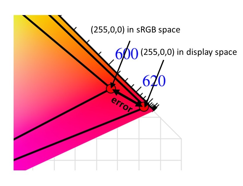
A wider-gamut display (and remember that a lot of displays are being marketed on the strength of having a really wide gamut) can be just as bad, too. Let’s say you’re dealing with a given image created assuming the sRGB standard is to be used. If some pixels in that image have RGB values of (255,0,0) — which just means “this pixel is supposed to be pure red” — what happens when the display uses the primaries shown in the diagram below?

The display will still give you a “pure red,” but it’s very different to the one whoever created the image (and was assuming the sRGB primaries) intended. It’s a purer, more saturated, more intense red. So even though the display’s gamut exceeded what’s required for sRGB, it still isn’t necessarily accurate.

Show a “pure red” – meaning RGB values of 255,0,0 – on a display with a different gamut than intended, and you get the wrong color. And that sort of error happens for any color in the space.
A few other major concerns determine whether or not a display is color accurate. Even if all of the primaries are spot-on, the display can still have problems with accuracy. If those pixels we were looking at earlier had RGB codes of (255,255,255) — all three colors set to their maximum level — generally we could assume it would mean “white,” but which white is intended?
Different color standards specify different “white points,” so the brightness of the three primaries at their maximums have to be set in the right relationship. The sRGB and Rec. 709 standards, both specify what’s known as the “D65” white (also often referred to as a “6500K color temperature”). Using the primaries specified for these, the relative brightness of each primary in terms of how much they contribute to the white is roughly 60 percent green, 30 percent red, and only 10 percent blue. If the maximum brightness of each primary isn’t controlled to hit these relative values, every color other than the pure primaries will be off to some degree, even though the primaries are dead on.
One last major source of color error has to do with the tone response, more commonly known as the ‘gamma curve.’
One last major source of color error has to do with the tone response, commonly known as the “gamma curve,” of each of the primary channels. As covered in my article last November, you don’t want a display to give a straight linear response to the input signal — it’s supposed to respond along a specific curve. These color standards also describe the expected display response. It’s usually roughly equivalent to a “gamma” value somewhere in the range of 2.2 – 2.5. All three primary channels should provide the same response curve. If any of the three is a little high or a little low at any point in the response, that will result in color error whenever it’s called for. In the monitor and TV markets, where having the primaries match the sRGB/Rec. 709 set pretty closely is actually the norm, response curve errors across the primaries are often the biggest single cause of color error.
See also: Display showdown: AMOLED vs LCD vs Retina vs Infinity Display
Speaking of color error, let’s talk about how the pros express just how much error you’re getting in a given situation. For any color a display is asked to make, there’s both the color it was supposed to be, and the color it actually displayed. Both of those, can be specified in terms of their color coordinates in a given space. So the most obvious way to express color error is simply to calculate how far apart these two points are in a given space.
A ΔE* value of 1.0 is supposed to represent a ‘just noticeable difference,’ or JND. It’s just enough error for the human eye to see the difference in the two colors if you put areas of each color side-by-side.
This number is expressed as a value called “ΔE*“, commonly read as “delta E star.” The coordinate system and calculations used to get this value are intended to make it perceptually correlated, which just means the relative size of the ΔE* value corresponds to how far off you perceive the color to be. A ΔE* value of 1.0 is supposed to represent a “just noticeable difference,” or JND. It’s just enough error for the human eye to see the difference in the two colors if you put them side by side. A value of 5-10 represents a color error that’s fairly easy to detect, and anything that gets into the 10-20 range is pretty obviously wrong if compared with the intended or reference color.
Having looked at what’s needed (just not always achieved) for a display to be accurate, we’re ready to tie this all together. Stay tuned for Part 3, where we’ll be covering how color accuracy is — finally! — coming to the mobile device markets, and how Android now includes the features to enable this.
Be the first to comment