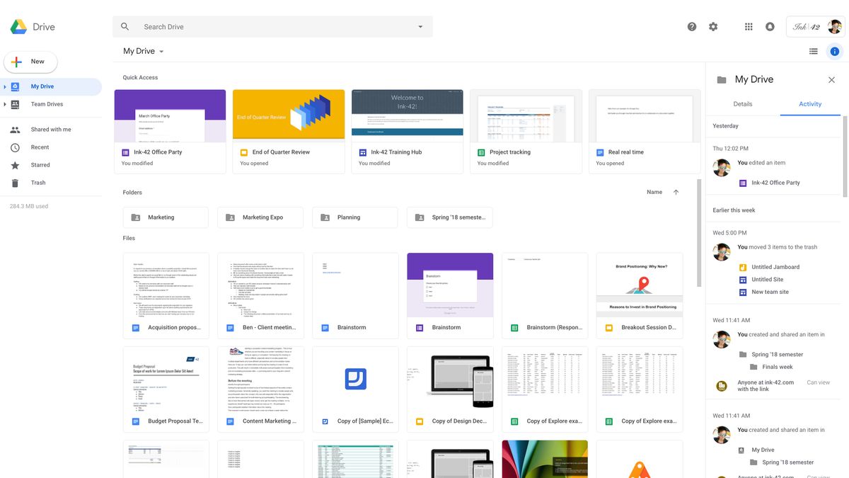
Google is rolling out a sleek new web interface for Google Drive. The update comes hot on the heels of last month’s Gmail redesign, but is much more subtle.
Unlike the new Gmail, which made major functional changes, the Drive update is purely cosmetic. As a result, Google has launched it with far less fanfare, slipping it out in the midst of its annual Google IO developer conference.
The button for creating a new document has been made larger and rounder to make it larger and easier to click (or tap, for touchscreens).
If you work for a business that’s added a custom company logo, this will now appear in the top right, keeping everything consistent with the rest of G Suite.
The page background is now white rather than grey (nice and fresh), headers use a different font, and the Settings and Help Center icons have been moved in line with the search bar (neat and tidy).
No way out
The redesign is being rolled out right now for users on the Rapid Release track, and everyone else will receive it in the next two weeks.
Unlike the Gmail update, you won’t be able to opt out of the Drive redesign. That shouldn’t be a problem though, unless you’re unusually particular about the arrangement of your buttons.
Via BetaNews
Be the first to comment