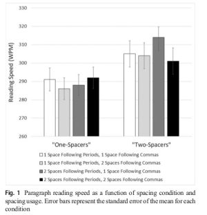
In what may be one of the most controversial studies of the year, researchers at Skidmore College—clearly triggered by a change in the American Psychological Association (APA) style book—sought to quantify the benefits of two spaces after a period at the end of a sentence. After conducting an eye-tracking experiment with 60 Skidmore students, Rebecca L. Johnson, Becky Bui, and Lindsay L. Schmitt found that two spaces at the end of a period slightly improved the processing of text during reading. The research was trumpeted by some press outlets as a vindication of two-spacers’ superiority.
For anyone who learned their keyboarding skills on a typewriter rather than a computer—and for the many who developed their keyboard muscle memory using software packages such as Mavis Beacon Teaches Typing—the double-space after the period is a deeply ingrained truth. While modern style, based on the fallacy that computer typography makes such double-spaces redundant and Paleolithic, has demanded the deprecation of the second tap of the space bar after a punctuation full-stop, many have openly resisted this heresy, believing that the extra space is a courtesy to the reader and enhances the legibility of the text.
Previous cognitive science research has been divided on the issue. Some research has suggested closer spacing of the beginning of a new sentence may allow a reader to capture more characters in their parafoveal vision—the area of the retina just outside the area of focus, or fovea—and thus start processing the information sooner (though experimental evidence of that was not very strong). Other prior research has inferred that an extra space prevents lateral interference in processing text, making it easier for the reader to identify the word in focus. But no prior research found by Johnson, Bui, and Schmitt actually measured reader performance with each typographic scheme.
So the Skidmore researchers decided to attempt to quantify the impact of single vs. double spacing at sentence-end. First, they divided their group of 60 research subjects by way of a keyboard task—the subjects typed text dictated to them into a computer and were sorted into “one-spacers” (39 regularly put a single space between sentences) and “two-spacers” (21 hit that space bar twice consistently after a period). Every student subject used but a single space after each comma.
Having identified subjects’ proclivities, the researchers then gave them 21 paragraphs to read (including one practice paragraph) on a computer screen and tracked their eye movement as they read using an Eyelink 1000 video-based eye tracking system. “Chin and forehead rests were used to minimize the reader’s head movements,” the Skidmore researchers wrote in their paper. “Although reading took place binocularly, eye movements were only recorded from the participant’s right eye.”
Paragraphs used four different sets of typographic arrangements, with five of the experimental paragraphs using each:
(1) one space after periods and commas;
(2) one space after periods, two spaces after commas;
(3) two spaces after periods, one space after commas; and
(4) two spaces after periods and commas.
Each paragraph was between 71 and 166 words long and was “presented in 14 point Courier New font,” the researchers noted.
And that’s where some of the extra controversy over this study begins. Courier New is a fixed-width font that resembles typewritten text—used by hardly anyone for documents. Even the APA suggests using 12 point Times Roman, a proportional-width font. Fixed-width fonts make a double-space more pronounced.
After ensuring that the readers had indeed comprehended what they read, the researchers evaluated the reading speed for each of the paragraph types presented in words per minute. The “one-spacers” were, as a group, slower readers across the board (by about 10 words per minute), and they showed statistically insignificant variation across all four spacing practices. And “two-spacers” saw a three-percent increase in reading speed for paragraphs in their own favored spacing scheme.
As the researchers concluded:
Punctuation spacing had no effect on the likelihood of regressing back to the punctuation region after leaving it, did not affect comprehension, and only increased overall reading speed for participants who already type according to this two-space convention (who only showed a three-percent increase in overall reading speed). Thus, while period spacing does influence our processing of text, we should probably be arguing passionately about things that are more important.
Ars’ style lords will continue to enforce the oppressive one-space-after-period standard, despite what science has to say about it.

Be the first to comment