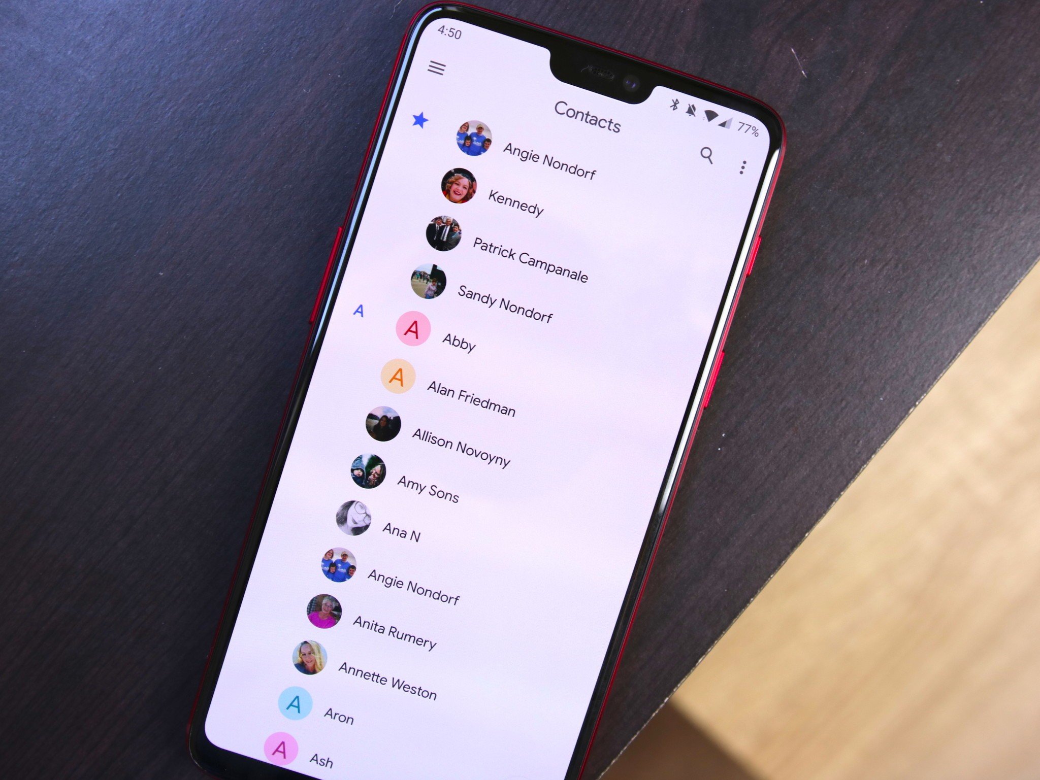

Although I loved the colors of the old Contacts app, I don’t necessarily hate what we have in 3.0, either. Having a consistent look/feel across Google’s apps is something that’s been missing for quite some time, and while we’re still in the early days of Material Theme, that consistency is already starting to take hold.
What do you think about Google Contacts 3.0? Sound off in the comments below!
Be the first to comment